

In the current logo design, Wikipedia uses the globe and puzzle pieces with different languages represented on each
piece to indicate their commitment to community and accessibility across 340 languages. Taking the notion of
accessibility, community and global, to represent the brand, this redesign focus in on accessibility
by utilizing the universality of Braille.
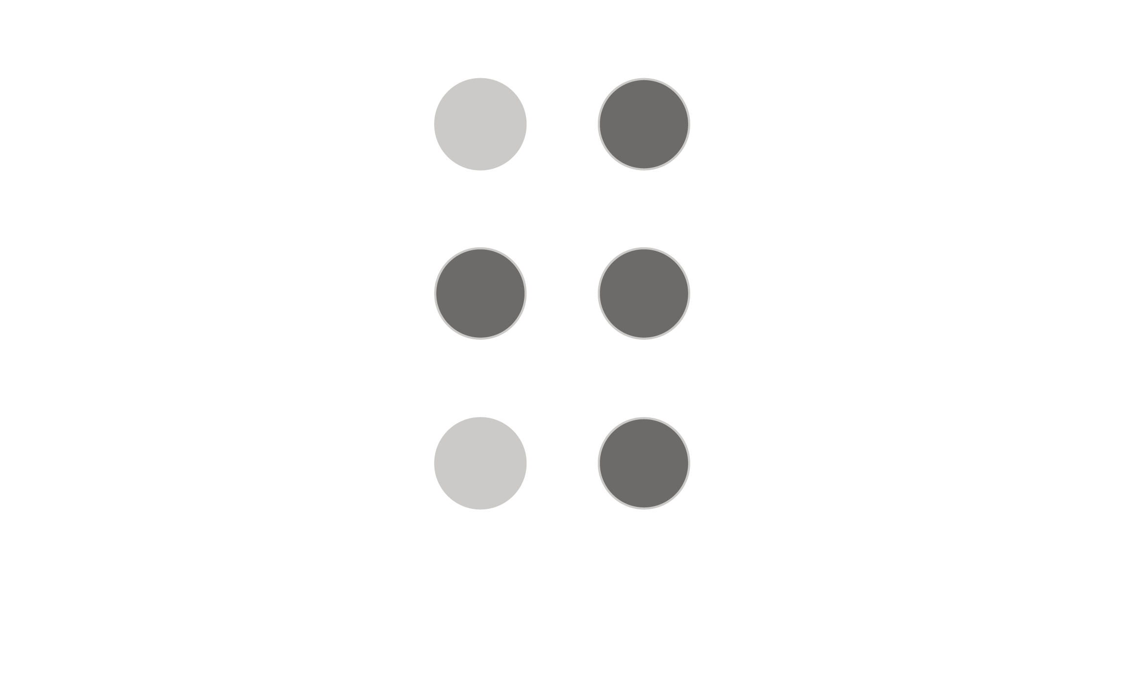
Braille runs on a 6 dot system and is transferable to multiple languages, including non-latin scripts. The system uses the
Latin-based alphabet and for non-Latin scripts, correspondences are generally based, where possible, on their historical connections
or phonetic transcription values. The goal is for a universal system that works in all scripts.
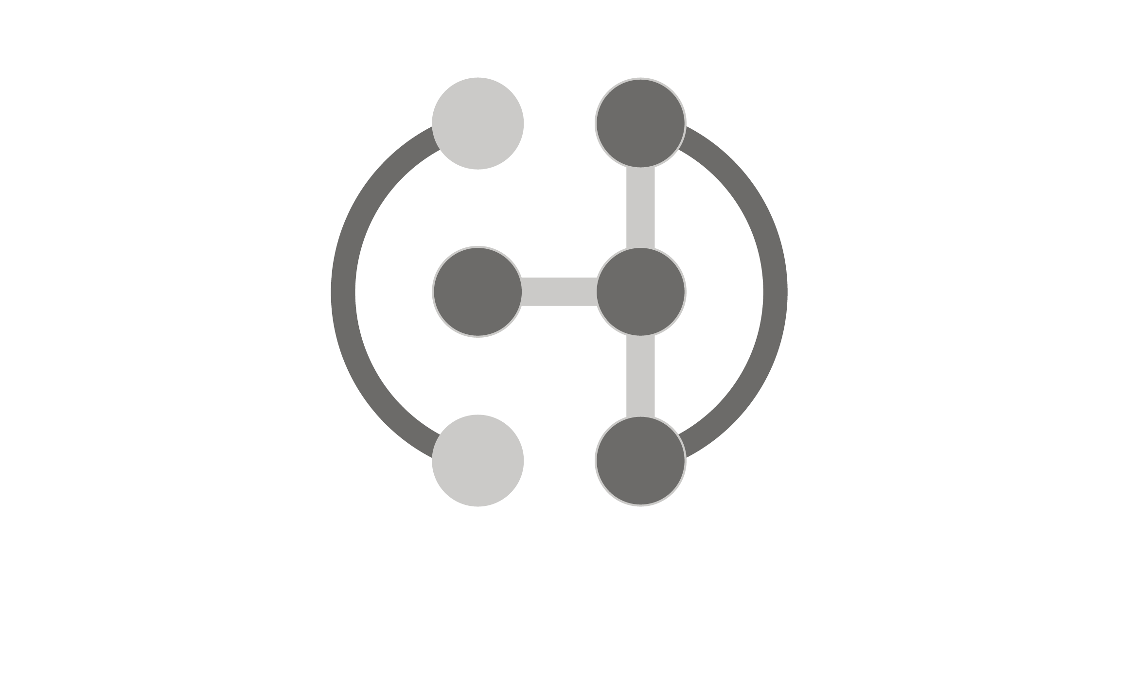
Using the braille W indicates accessibility across the world, cultures and languages. The circular shape of the logo emphasizes
global and connectedness. The use of Braille for the rebrand shows the brands commitment to access and does not prioritize Latin based
over non-latin based language or a select handful of languages the way the current logo does. Braille evokes a sense of reliability
because it has to be for visually impaired people, it feels trustworthy. This design incorporates reliability, accessibility,
and community as well as neutrality.